
Mr. Hobbes Takes a Vacation, Henry Koster, 1962
The main function of film titles is to display the movie's title and to credit the director,
producer, various actors and other artists and technicians that have worked on a film. But more importantly the titles must prepare the viewer for the viewing of the film. The history of film titles goes back as far as vaudeville theaters, where main titles were originally produced by the magic-lantern or the first projector, which was invented in the 1650s, probably by a prominent Dutch scientist, Christiaan Huygens. By the end of the nineteenth century, magic-lanterns were quite prevalent public entertainment. The lantern projected hand-colored slides on a full-sized screen. Joseph Boggs Beale (1841-1926), was America's first great lantern artist, who as a young man in the 1850's attended several "Christmas" magic-lantern shows in Philadelphia church halls. Later on, he created a vast repertoire of 250 illustrated stories, songs, history lessons, and rituals as part of his publisher's effort to make great literature available on screen to the public at large. The slides, which were often animated had a narrative that were unusually written on cards that were predecessors to today's film titles.
With the advent of "nickelodeon" theaters around 1905 which were showing thrillers like "The Great Train Robbery," the magic-lantern quickly disappeared and the age of silent movies began. The earliest titles, for silent films, were presented on title cards. These were cards with printed material on them that were photographed and incorporated into the film. Words and lettering played an enormous role in films of the silent era. Film titles made their appearance in the earliest silent films, along with letter cards (or inter-titles), which provided context. In addition to hiring lettering artists, the prominent film studios began to employ typesetters in the production of title cards. These cards were the responsibility of the lettering artist, who collaborated with the scriptwriter and director to create narrative continuity so that audiences could follow what they were seeing. J. Stuart Blackton who directed �Humorous Phases of Funny Faces� (1906) created one of the first animated opening title.
 |
| Die Abenteuer des Prinzen Achmed, Lotte Reiniger, 1926 |
In 1926, Lotte Reiniger created Die Abenteuer des Prinzen Achmed --The Adventures of Prince Achmed, an animated German feature film, with Art-deco style of typography that tried to imitate Arabic scripts. This was the earliest animated opening title.
 |
Titles for D. W. Griffith film, Intolerance, 1916 |
 |
Nosferatu: A Symphony of Horror; Directed by F.W. Murnau , German 1922 |
 |
Der blaue Engel, directed by Josef von Sternberg, 1930 |
The role of graphic design in the earlier movies, until 1960s, was restricted to lettering artists' composition of a typeface and some minimum decorative patterns. At times, some title designers were daring with the design of their typeface, such as Albin Grau's titles for the classic German movie Nosferatu, Eine Symphonie des Grauens, in 1922, which was quite innovative and modern with respect to its handwritten art-nouveau typeface. The font was created by German typesetter Heinz Hoffman in 1904. There have also been from time to time some strokes of genius in creation of titles. For example, the stunning composition of typeface in the title for
Der blaue Engel, directed by Josef von Sternberg, in 1930; was such an instance. However, such innovations were few and far between.
 |
| Alfred Hitchcock, The Lodger: A Story of the London Fog (1927) |
Perhaps it was in 1927 that modern graphic design appeared for the first time in the titles of a movie.
The Lodger, : A Story of the London Fog was the third film of Hitchcock -- but was his first to be seen by the public due to studio politics. C. M. Woolf, the chief of Gainsborough studio, was not impressed with the Hitchcock work, and found the movie too arty! As a result, Ivor Montagu, a Cambridge educated film editor, was commissioned by the producer Michael Balcon to correct film's short comings. Montagu reduced the intertitles from 400 to 80, and had Hitchcock reshoot segments of the climactic chase scene. But, more importantly, from a graphic design perspective, he contracted E. McKnight Kauffer, an American graphic designer living in London, to create the new title art, with text in Newland typeface, which was inspired by the German Expressionism.
Nevertheless, the graphic designs of the 1930-50 period were very conservative and unimaginative. Perhaps the studio bosses, in their attempt to appease the lowest common denominator of the movie going public taste, were fearful of introducing any bold designs. Such a banal tendency was prevailed still during the invention of Technicolor, and even directors such as the Hungarian-American Michael Curtiz, who apparently was interested in illustrated titles for most of his films, did not strayed far from it. The most bold and innovative of graphic designs of this era were the
After the Thin Man of 1936 in the black and white; and Fantasia of 1940, and Duel in the Sun of 1945 in color.
 |
| Jimmy the Gent, Michael Curtiz, 1934 |
 |
| " After the thin man", Directed by W.S. Van Dyke, 1936 |
 |
| Duel in the Sun, King Vidor, 1945 |
 |
| Drums Along the Mohawk, John Ford, 1939 |
 |
| Pinocchio, Ben Sharpsteen, 1940 |
 |
Fantasia, James Algar, 1940 |
During the 1960s, a preference emerged among the avant garde filmmakers, such as Godard, Fellini, Antonioni, and others to emulate von Sternberg's white-on-black title lettering of
Der blaue Engel. This style became a kind of prestige symbol among all those movie makers around the world who wanted to be a member of this virtual avant garde club. Examples consist of Woody Allen who used this style in almost all of his films including Annie Hall, Tsai Ming Liang, the "Second New Wave" film director of Taiwanese Cinema who used this style with Chinese script in his
What Time is it Over There? in 2001 and the celebrated Persian movie maker Bahman Ghobadi in his
A Time for Drunken Horses in 2000, as well as many others.
 |
| A Bout de Souffle, Jean Luc Godard, 1960 |
 |
| La Dolce Vita, Federico Fellini, 1960 |
 |
| L' Avventura, Michelangelo Antonioni, 1960 |
 |
| Annie Hall, Woody Allen, 1977 |
 |
| "What Time is it Over There?", Tsai Ming Liang, Taiwan, 2001 |
 |
| A TIME FOR DRUNKEN HORSES, Bahman Ghobadi, 2000 |
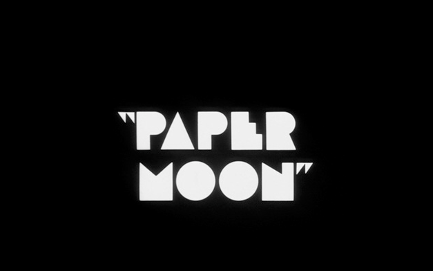
This trend was quite unfortunate, as it is clear that an avant garde movie can be enriched further by an imaginative and bold graphic design. The following titles clearly have added to the artistic aura of their respected films, and to the film viewers, in fact, they were powerful signals of the aesthetic sensitivity of the directors. For example note, how stunningly elegant was the added graphic design element to the simple white-on-black lettering in the main title frame of Stanley Kubrick's
Spartacus, or how tasteful, compositionally powerful, and aesthetically exquisite were Maurice Binder's title design of
Dr. No, Paper Moon of Peter Bogdanovich,
MASH of Robert Altman, or Charade of Stanley Donen
. Of course, creating a high quality cutting-edge design is not very easy, and the task gets harder with the appearance of each innovative design. As the low hanging fruits of design are becoming picked up, the creation of a new bold design becomes more challenging, since in addition to a creative talent, it would require a greater depth of understanding of various socio-cultural issues in visual communication, and a more refined artistic skills. This is evident from very few innovative title designs that have been created over the 1990- 2000 period. But the existence of this burden cannot be regarded as a good excuse for not trying to search for creative talents that can rise to the occasion. In fact, it is interesting to note that Jean Luc Godard himself, who perhaps started the white lettering on a black background style of the 1960s, abandoned it in his 1967
Week End.  |
| Dr. No, Terence Young, 1962 |
 |
| Plein Soleil, Ren� Cl�ment, 1960 |
 |
| Spartacus, Stanley Kubrick, 1960 |
 |
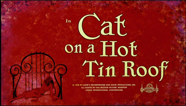
| Cat on a Hot Tin Roof, Richard Brooks, 1957 |
 |
| Charade, Stanley Donen, 1963 |
 |
| For a Feastfull of Dollars, Sergio Leone, 1963 |
 |
| Doctor Zhivago, David Lean, 1965 |
 |
| Week End , Jean Luc Godard, 1967 |
 |
| In Cold Blood, Richard Brooks, 1967 |
 |
| Last Tango in Paris, Bernardo Bertolucci, 1967 |
 |
| MASH, Robert Altman, 1970 |
 |
| Paper Moon, Peter Bogdanovich, 1973 |
 |
| Inglourious Basteros, Quentin Tarantino, 2009 |
 |
| From Dusk till Dawn, Robert Rodriguez, 1996 |
 |
| Caro Diario, Nanni Moretti, 1993 |
 |
| Irma Vep, Olivier Assayas, 1996 |
 |
| Monsoon Wedding , Mira Nair, 2001 |
The opening title sequence for To Kill A MockingbirdThis masterpiece of title sequences starts with a soft and fading few bars of Elmer Bernstein music, while the camera with an overhead point-of-view shoots Scout, the young girl narrator of the story who is opening and looking into an old cigar box of collected memorabilia -- her treasures and trinkets, which includes: crayons, a mechanical pencil, two carved soap doll figurines, a skeleton key, a broken pocket knife, and some other objects, but most importantly, an old broken but ticking pocket watch, a remembrance of Atticus. Scout picks up a crayon and sets in motion the quiet, unintentional roll of a marble. She colors over lined paper with a round crayon, revealing the title of the film, and the camera circles and tracks slowly from left to right along various collections of carefully-arranged objects in magnified close-up, while Elmer Bernstein's music plays. Frankfurt achieves a near perfection that requires a deep contemplation for deciphering its many layers of meanings, and mystical quality.
Design Director Stephen Frankfurt describes how he has created the opening credit sequence to "To Kill a Mockingbird."
Too see the opening title sequence for To Kill A Mockingbird click in this icon
The Art of Animated Title Sequence
As we have seen in the previous chapter Saul Bass' animated titles for
Around the World in Eighty Days,
The Man with Golden Arm and his other films revolutionized the art of film title.
In Hitchcock's North by Northwest, with a backdrop of a music score by Bernard Herrmann, Saul Bass has created a remarkable opening title sequence which is generally being cited as the first to feature extended use of kinetic typography. Cast and crew names enter and exit from the top and bottom of the frame, imitating the movement of elevators going up and down and stopping on various floors, against a background of the bright green screen, with dark angled lines on a north-westerly diagonal slant. Midway into the credits, the lines dissolve into the windows on the front of the United Nations building, reflecting New York City street traffic below. The credit sequence closes with crowds of people hurrying in and out of the subway and city buildings. Director Alfred Hitchcock makes his signature on screen appearance as his credit appears, hastening to reach a bus, only to have it drive away after slamming its doors in his face.
The title design for Hitchcock's Vertigo, again by Saul Bass.
Vertigo 1958 Alfred Hitchcock Start Titles by generique-cinemaIn 1964, when Blake Edwards completed the shooting of his slapstick comedy The Pink Panther, he realized that his film should have a witty and elegant animated opening. The film's narrative was about the Phantom (David Niven), a well-bred gentleman who supported his expensive life style by robbery. He was now planning to steal the most valuable jewel in the world "The Pink Panther," so called because of a flaw in it that looked like a tiny pink panther. The story was interesting because the most famous French detective, Inspector Clouseau (Peter Sellers) with all his idiosyncratic manners and clumsy skill set was assigned to the case. And the story was getting more complicated by a further twist; Clouseau's wife was the Phantom's mistress.
Edwards contacted one of his associates David DePatie saying to him that his latest film is "screaming" for an animated title sequence. DePatie discussed Edawrd's project with his business partner. He had teamed up with Fritz Freleng when the Warner Bros. studio stopped making cartoons in 1963, to form DePatie-Freleng Enterprises, an animation studio. Fritz Freleng a creator, director and producer of animated movies at Warners for 33 years, immediately fell in love with the project and had his crew draw up around 80 different designs to represent pink panther. When they showed these sketches to Edwards, he immediately pointed to one exclaiming that "this is it!" The design chosen was one from the group led by Hawley Pratt, a great draftsmen, who had been one of the key layout artists at Warners, and whose name appeared on many shorts in the early Sixties as a co-director with Freleng and Chuck Jones.
The DePatie-Freleng studio began to work and created the stunning opening animated titles. In the opening title the pink Panther appears out of the flaw in the gem, while holding a cigarette in the holder and sitting on his haunches turns to the audience and smiles. He also reappears at the film's end to hold up a "the end" sign. The opening sequence became an instance success, the ever-suave cat, that eternal prankster in princely pink who never looses his nerve gained an iconic status with the synchronized score visualization of Henry Mancini's enigmatic and playful theme. The film's sequels, including the second American installment followed this tradition of animated titles. In the words of the veteran main title designer Karin Fong of Imaginary Forces, who revived and updated the character of the panther �for today's audiences� in the Pink Panther 2;
�An influential main title for me was the original Pink Panther cartoon, because it really played a lot with the typography in a very cartoony way. I am a huge fan of things like Sesame Street and Schoolhouse Rock... Some people would say 'cartoon style,' but it's really quite clever how you work in the word play and visual puns. That always struck me as a very imaginative main title ... It departed from the look of the movie, which is live action, yet became a signature for the film.�
�Of course they've been making an animated Pink Panther title for each of the movies over the years. Over time you can see differences in animation style - the characters have changed a little from the early 1960s till now. You have to remain true to the Panther character � that sense of mischief, yet being a really cool cat. This movie takes place in the present day and it's very important to connect it to the present day. It's about capturing that spirit of the Panther, the kind of jokes he would play on the inspector, the kind of antics they would have. But yet giving it the backgrounds, the sceneries, the effects that would update it for todays audiences.�
Unfortunately, the embedding of the original 1967 is not allowed but can be found
here. Here is the title sequence for the Pink Panther II.
Susan Bradley's
Monsters, Inc in 2001 is another great animated sequence in recent times. She was the manager of Walt Disney Studios� Title Graphics Department for six years. Bradley then moved to design titles for a number of live action films. In 2006 she contributed to the Pixar's animated film, Ratatouille. Her parents were both artists, her dad was a commercial photographer studying at Art Center and her mom was a layout artist in advertising. According to Bradley, her "super modest" family "had a design-centric household." In her career she is inspired by hand-lettering artist Harold Adler who is described as a true craftsman during the birth of modern title design, penning almost all Saul Bass� titles and for many other designers in the industry. Adler tutored her in calligraphy and shared his hand-lettering and production experience with Saul Bass and Hitchcock.
According to Bradley :
Film titles certainly welcome you and wave goodbye in a very crucial and visceral way, but I don�t think they have much weight as it relates to �success�, unless that�s all the film has going for it. I think the biggest mistake is seeing the title sequence as separate from its film. In my opinion, they can do very much or very little; but really shine when they live within the story and reflect an important quality driven by your Director.
Maurice Binder, designed the stunning title sequence for the first Bond film,
Dr. No. in 1962. Robert Brownjohn created the credits for
From Russia With Love and
Goldfinger and then Baker returned to do all the next thirteen Bond's credits from 1965's
Thunderball to 1989's
License to Kill,. Binder together with Arcady was responsible for the opening sequence of Roger Vadim�s �Barbarella�, which features an unrestrained intergalactic planetary aviatrix Jane Fonda taking off her space suit in the kind of weightless striptease. Bider's title opening stands tall even in comparison to today's digital editing technique. Title text spills from the head Barbarella, chaotically at first, then coalesces in credit, and finally plays the coy cover up. Binder was born in New York in 1925, and studied art. After graduation he became the head of advertising for Macy's before eventually going into movies. He died of lung cancer in 1991.
Digital technology has drastically changed the art of title design in recent times. The process of creating animated film titles have been dramatically improved using computer generated imagery (CGI). Conventional animation of titles which was once labor intensive, and costly has become more affordable, and cost-effective thanks to the development of sophisticated software programs that can produce 3D images and that can replicate closely the reality. Even facial expressions, and emotional sensitivities of characters can be replicated without much of costs. As well, the costs of producing realistic looking special effects, optical illusions, and so on have been reduced by an order of magnitude. The technology allows the designer to have greater control over his creation. All these would allow the designer to concentrate on his artistic creativity. The future looks bright. Here is the Title sequence for Spiderman 2.
Go to the next chapter; Chapter 40; A history of Caricatures, and Political Cartoons -----------------------------------------------------------------------------------


